A leading expert in wine branding and design for the international market, Neil Tully MW reflects on the attributes of a successful wine label
Although wisdom would say “never judge a book by its cover”, wine consumers are running against that advice – and increasingly so. Research by Wine Intelligence indicates that, each year, drinkers remember fewer wine facts – such as producers, regions and grapes – and base their purchase decisions more often on visual cues: attractive and memorable packages, that stand out on a shelf and offer clear information. At the same time, data shows that consumers are looking for safety, which has become particularly important during the pandemic: recognizable brands, with labels that convey classic and familiar elements of the wine world (find out more).
That is simple enough to understand in theory but rather difficult to put into practice. So, finding this balance between distinctiveness and centrality – standing out, while being reassuring – will be a central challenge for our industry. And to shed some light on how wine businesses can create successful brands and packages for increasingly visual consumers, Winext Blog has interviewed the world’s leading expert on wine label design, Neil Tully MW.
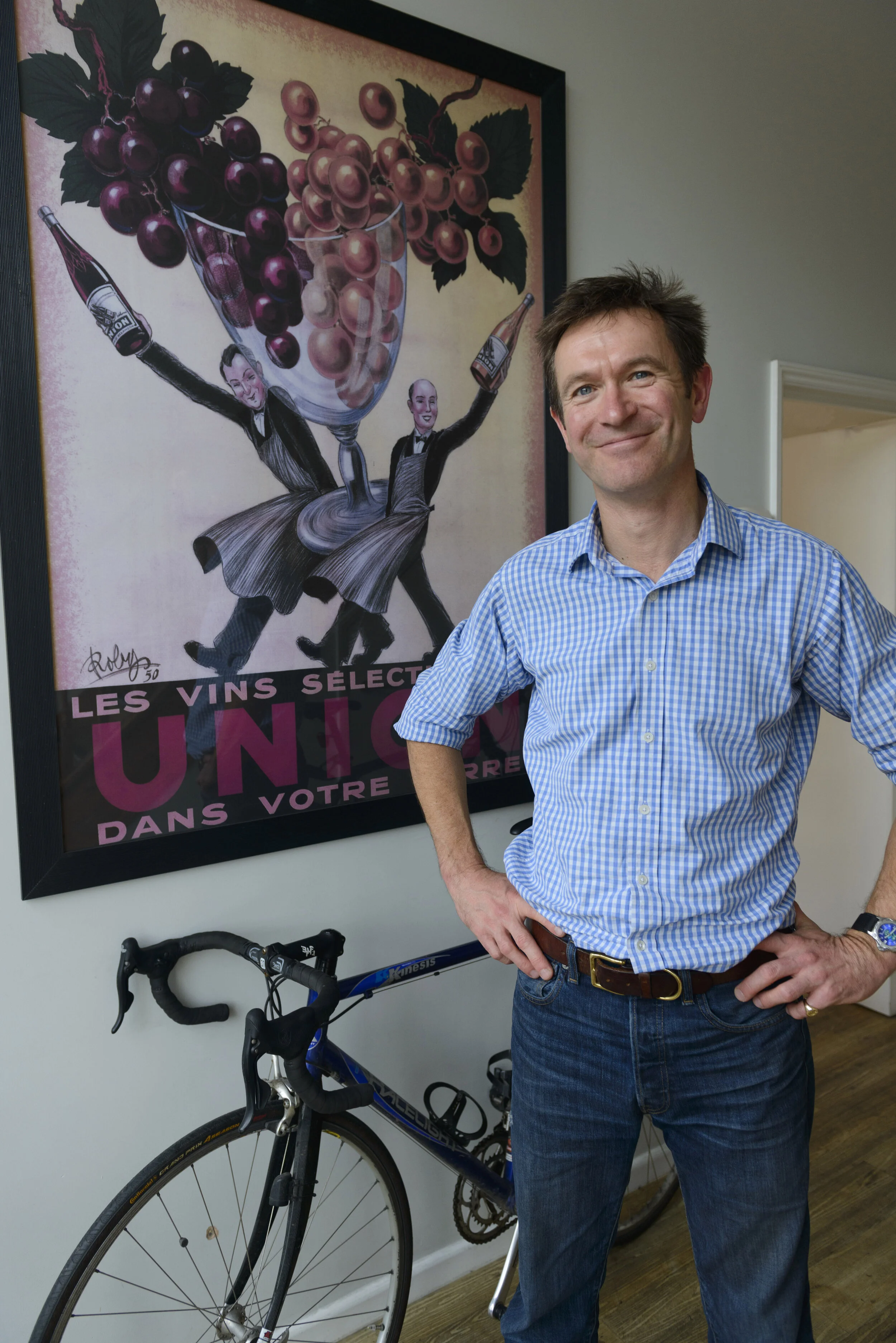
Founder and Creative Director of Amphora, a UK-based consultancy specialized in Design and Branding for the global wine market, Neil also holds the title of Master of Wine (MW) – the most prestigious international qualification for wine industry experts. In this interview, he talks about the impact of Design on wine drinkers’ choices, the most important factors in creating a successful wine label, and the challenge of appealing to consumers across different markets. Talking to us from his office in the historic city of Bath, South West England, he also shares some of the most interesting cases Amphora has worked on in the last years in different countries around the wine world.
Do not miss any of Winext's articles. Follow our Facebook and LinkedIn pages, and subscribe to our newsletter here!
Founder of Amphora, Neil Tully MW is a leading global specialist in wine design and branding, having developed wine labels for several markets in the world of wine (Credit: Tony McNicol).
How does your story in wine and design begin?
After leaving school I studied at Central Saint Martins College of Art and Design, in London; those were brilliant three years in one of the best art schools anywhere. But at the same time, I also discovered wine. I went straight to work for a small independent wine merchant in London. I passed the Institute of Masters of Wine's exam while I was still working and then we had the recession of the 1990s.
At that moment, it looked like I probably was not going to have a job. However, a fellow MW, a contemporary, had just sold some wine to one of the UK’s supermarkets, and they needed a label. As I went to art school, they asked me if I could help, and I thought that maybe I could. And that was when Amphora happened.
“We do not have to be briefed about the situation of different wine markets and we can go straight to where the wine is coming from, what is its point of difference.”
I realized that the needs were very specific: it was a one-off parcel of wine and it had to happen quickly, to a reasonable budget, while also being effective. So those are the principles that we worked with all along since 1992 when I founded Amphora. We have to be agile, we’re a small team, and we know wine, we do not have to be briefed about the situation of different wine markets and we can go straight to where the wine is coming from, what is its point of difference. We can quickly come to the right answer for whoever we are working with.
The Amphora team are experts on the wine industry; Neil has been a member of the Institute of Masters of Wine since 1993, where he is currently Chief Examiner (credit: Amphora).
Do you think the wine industry pays enough attention to label design?
Often, they still do not. It is something very symptomatic of our industry to be very interested in investing in the winery and in the vineyard but tends to slightly forget Marketing and Design. It has been 28 years since I began working with label design, and I have often seen that producers are happy to invest in stainless steel tanks and lovely wineries. But their bottles go into the market looking, frankly, dreadful. And that bottle is the one thing that anyone is ever going to see from this producer: they will never be lucky enough to come and visit this exquisite winery; they will only see that label, on that bottle, in some rainy country. So, please, do spend some money on your label! It is one of the few pieces of consumer packaging that people put on the table. We have our friends around it, they all see that label and we get judged by it.
How much has that changed since you started?
Things are moving forward. Many of the companies we work with now have put people into the organization who understand Marketing, Design and the importance of these processes. But when Amphora started, back in the early 1990s, a client sometimes did not even know how to write a Design brief. I had to spend quite a bit of time putting a brief together with clients, establishing what they wanted to do, how and why they wanted to do it. Even today, sometimes we still have to help our clients a good deal in this process.
“We can judge success by whatever success means in that project: in some cases, it will be receiving Design awards; in others, it will be purely commercial, sales; and sometimes it will be both.”
As you know, Design is very subjective and without a good brief we always run the risk that someone will appear in the middle of a project and say: “I don’t like blue”. And then months of work go out the window. So, it is truly important to have a brief that establishes our goals and that everyone has signed up to. This way, we can take out the subjectivity and measure what we do against that brief. Then we can judge success by whatever success means in that project: in some cases, it will be receiving Design awards; in others, it will be purely commercial, sales; and sometimes it will be both.
So, what are the basic questions that must be answered in a label design brief?
I do not believe there is a perfect version. But there is one really important question that we will always ask: what are the strategic and commercial objectives of that project? And I think that can be very often overlooked. It is not just about producing something that looks good; it is about creating something that will make customers respond in a certain way. So, the key question to be answered in a brief is: what does it need to do out there in the market? Because I know that if it is a well-designed label, it will succeed in that job.

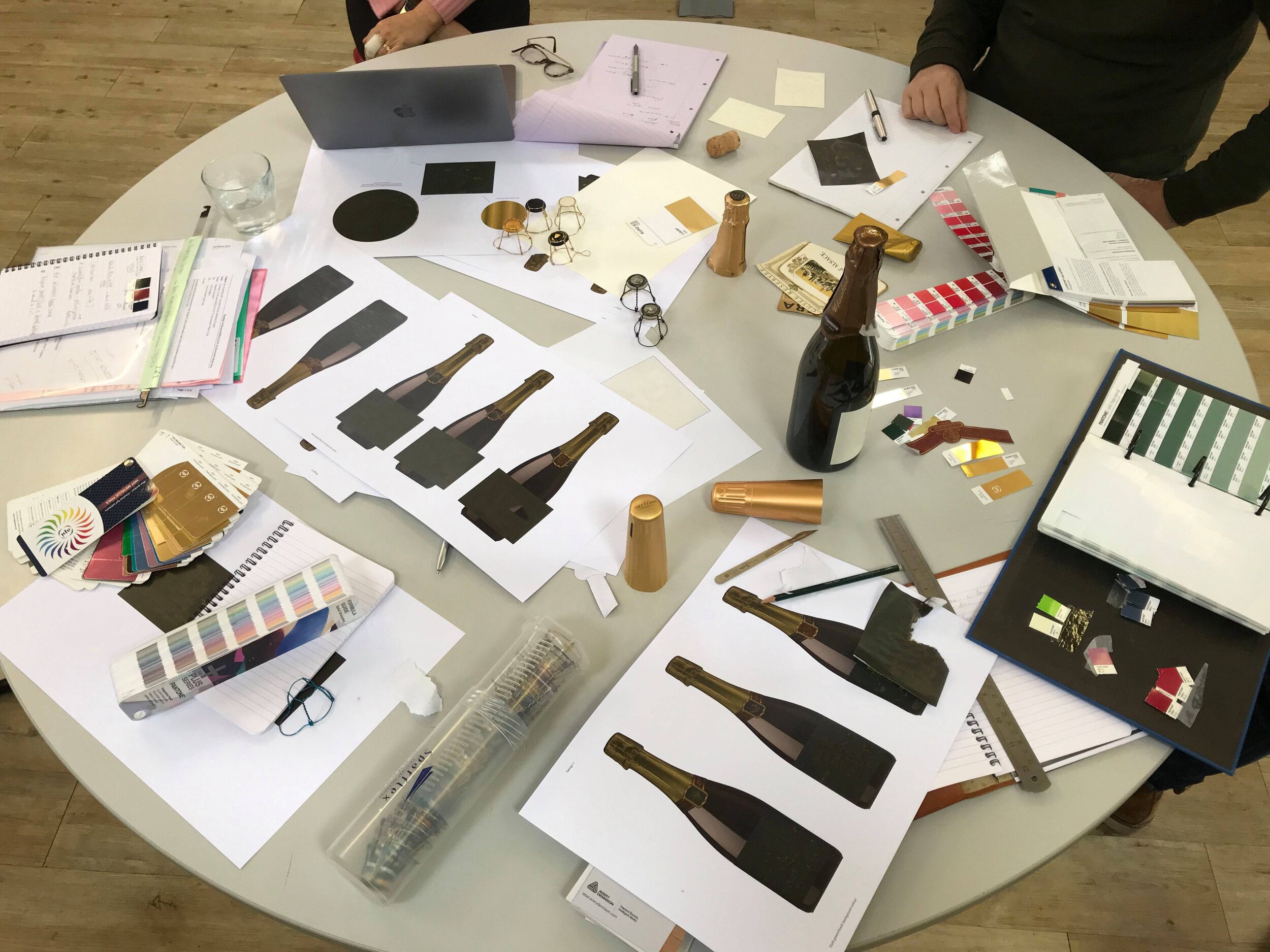
The design brief is central to defining the strategic objectives of the product in a market; in this label for a retailer, Amphora had to meet a very specific consumer need, which resulted in great commercial success (credit: Amphora).
Do you go outside the wine universe to get food for thought and inspiration for your ideas?
I think everybody that is visual or creative is constantly collecting ideas, thoughts and images. I always tell my team that we need to get out, to look at things in reality, not just on a screen. Somewhere in the mind all that is getting crossed over, processed, and the right creative triggers can then start the process.
During the pandemic, our team had to work apart for a while, and we realized how important it is to work together for the creative process; that you can scribble something down on a page, point at something, or talk about something, then a second person will respond to that, and a third. Right now, some of our team is working from home, but we come together maybe once a week, or every ten days, to exchange ideas and to trigger thoughts in each other’s minds. It is impossible to be creative apart.
“The challenge is to figure out what people do not yet know they want. What is next? They do not yet know what that is until we put it in front of them.”
In that process, looking outside the category is important. We look at consumer trends in other industries, always trying to have a finger on the pulse of what is happening outside wine and how customers might be influenced by that. You know, the wine industry is not always brilliant at that: it is quite a conservative category. So, we always have to push for innovation; but only as much innovation as the category and consumers feel comfortable with. The challenge is to figure out what people do not yet know they want. What is next? They do not yet know what that is until we put it in front of them.
What are the central aspects of a good wine label?
I have judged quite a few wine labels in Design competitions, so I have had to think really hard about that question. There are a lot of basics that need to be there: good execution, good print, good production and, it goes without saying, a good idea. But one thing that will set something apart is what I describe as an “emotional pull”. So, if you look at a row of wine labels, a lot will affect you in your head; but one of them might get you in your heart. A good piece of branding will do that. It can take many different shapes and forms, but if it gives you a feeling, it has succeeded. That is the gold standard.

According to Neil, a wine label achieves the gold standard when it has an “emotional pull”; for this Australian wine, Amphora brings beauty, simplicity and a design that speaks to the heart of consumers (credit: Amphora).
What do you think about the importance of liquid versus packaging in consumers’ choices?
There is a really short answer to that question: get the label right and people will pick up the bottle and buy it once; get the liquid right, and people will come back and buy it again. In other words, they will buy your wine for the label once – they like the label and may have no idea what the wine is going to taste like. But if the liquid is not right, they will not buy it again. I think consumers are not stupid, a lot of them can tell if the flavor is right and if it represents good value for money.
“The thing is that it is very easy nowadays to make something look high-quality and expensive; it is more difficult to pitch something that brings beauty and simplicity.”
Years ago, there were a lot of aggressive price promotions going on in the UK market: “buy 1 get 1 free” and “3 for 10 pounds”. And lots of clients would brief us saying they wanted their bottle to look like it was twice the price they were going to charge. I would advise them: no, please do not do that because customers will be disappointed. If they think your product looks like a 10-pound wine and it tastes like five, they will not buy it again; they will feel cheated. That will not be good for your product or for the wine industry.
The thing is that it is very easy nowadays to make something look high-quality and expensive; it is more difficult to pitch something that brings beauty and simplicity. The quality of design does not have to suffer, but it must have an honest and authentic relationship with what is in the bottle. We worked on a label for the UK supermarket Waitrose, which was exactly like that: very simple, very honest, but it was not pretending to be something it was not. Even if customers are not experts, they know the difference.

Neil argues that a wine's packaging should honestly represent the liquid it contains; in this project, Amphora sought to convey a very clear, democratic message – in a stylish manner – about flavour profiles for these entry-tier wines of British supermarket Waitrose (credit: Amphora).
Attracting the Millennial generation to wine is one of the great challenges of our industry. What kind of label design and packaging do you think are most appealing to these young drinkers?
It is quite a complex situation I would say. There is a portion of the Millennial generation who want wine to look like wine. But there is also an element who want it not to look like wine, and sometimes not even to taste like wine. So, I do not think there is a clear-cut situation at all; it is quite fine-grained, and the wine industry cannot afford to pigeonhole consumers too much. There must be a balance between being reassuring and at the same time eye-catching and disruptive; that is what we call centrality versus distinctiveness. Being able to articulate these elements is very important and there is often a fine balance.
“That is distinctiveness and centrality in practice; it is finding a balance that is right for the market, right for the product and right for the category.”
For example, if you imagine that we want to use a very conventional bottle shape, something that is really reassuring: let’s say a traditional Bordeaux-shaped bottle with a traditional cork closure. In that case, maybe I can do something more disruptive on the label; because that is against the background of something that is fundamentally reassuring. On the other hand, if I had a bottle that was really disruptive for the wine category – maybe with a different shape, color or material. Then, I might need to put a label on it that says: This is ok, the wine is good.
These are slightly crude examples to demonstrate how we can balance off our disruption. And perhaps this disruption is what Millennials are interested in, maybe that makes the category exciting. But there is also an element of reassurance that must be present. That is distinctiveness and centrality in practice; it is finding a balance that is right for the market, right for the product and right for the category.

In the design of this Italian wine, Amphora masterfully established a balance between distinction and centrality: innovative colors and shapes, against a highly classic wine label background; the design also adapts to the reality of an anglophone market: instead of the name “Primitivo”, normally used for this grape in Italy, the wine presents itself as “Zinfandel” (credit: Amphora).
And how can one know if this balance is right in a label design?
I think I have done this for long enough to say that, if you have the right people to drive a project – brand owners and managers, experienced professionals who really understand the market and the product – it is about a gut feel. It is something quite brave to say: “Let’s give this a go”. And that is when some of the best things have happened. I do worry sometimes that too much research for label testing can kill things off, because it removes a necessary risk that comes with creativity. Sometimes research can be good and underpin certain decisions, but we have to be very careful about how it is used.
For instance, there is a label we designed for the UK market called Les Dauphins, a wine from the South of France. I reckon if that had been previously tested in consumer research it would never have looked the way it did. It was almost a bit shocking when it first appeared, but that is what made it very distinctive and memorable. And that is another good example of distinctiveness and centrality: we lined this wine up on a shelf with a competitive set, all of them sold at similar prices, and at the same time Les Dauphins stood out and looked at home.

Already a classical example of distinction and centrality in wine design, the label of Les Dauphins was created by Amphora for a wine from the South of France and has captured the attention of drinkers in 35 countries; it stands out on a shelf while conveying familiarity to wine drinkers (credit: Amphora).
And when can one be extremely disruptive, either completely changing a brand or creating a very disruptive design?
We always have to be careful, because, as we have said earlier, wine is quite a conservative category and customers can be very loyal to the brand they know. And sometimes it is possible to move too far too fast and we can leave the customer behind. However, if a brand is not well established, or less successful, maybe it is a good case to say: we are going to change this completely; that could be the shock treatment it needs. But if the brand is alive and working, I would do it gently.
“Still, we are largely dealing with glass bottles and printed labels on them. It is surprising how much things can move, and yet so little changes.”
About extreme innovation in label design, I think a lot depends on your objectives because it can work very well in some parts of the market, but for the mainstream public maybe that is much more difficult. As creatives and designers, we always want to push the boundaries but, equally, we need to know how far is far enough. We are still in a category that tolerates change only so well; that is why change has to be incremental, step by step. Still, we are largely dealing with glass bottles and printed labels on them. It is surprising how much things can move, and yet so little changes.

The level of disruption in a wine design will largely depend on the goals of the project and its target public; for this exclusive brand, Amphora had the challenge of expanding the wine's appeal in the on-trade context (credit: Amphora).
Do you think the pandemic and the situation we’re going through will bring any innovation in packaging and label design?
I think there are two aspects to this. The first is about the functional packaging: the fact that people are buying wine to drink more at home, so they want convenience. We have seen an increase in bag-in-box, and we have been doing a lot of work with cans in the last couple of years – especially with premium wines. So, I think we are going to see those physical containers beginning to change a bit.
“There is something about comfort during challenging times – we all want the familiar, the comfortable.”
The second aspect is that well established and familiar brands have been massively successful in our markets during the pandemic. Maybe because people are buying online and trying not to visit stores too often, they are taking fewer risks. There is something about comfort during challenging times – we all want the familiar, the comfortable.
I really hope that, as the pandemic comes to end, we might see a bit of a reaction against all that. I think we need to be ready to be creative and to bring exciting new things for when people can go out to enjoy eating and drinking. I anticipate a good creative surge and a bit of a new vision for the wine category as well.

The search for safe and well-established wine brands is a trend that accelerated during the pandemic; for Louis Jadot, Amphora's task was to reinterpret one of the most iconic labels in the world of wine, while keeping it perfectly recognizable for drinkers (credit: Amphora).
Have you worked on any recent design for alternative wine packaging?
We worked on a project with premium wines in cans just over a year ago, in which we were asked to somehow represent the flavors of the wines on the packaging. There was a Gruner Veltliner with a bit of weight to it, also a Touriga Nacional with some really opulent jammy fruit. And we went some way to express these flavors, textures, and the personality of the wines on the packages. It is not simple, but I think we can begin to have that sort of connection between what is on the outside and what is on the inside.
You have also mentioned an e-commerce trend. Is there a difference between designing a label for physical and online stores?
Yes, we have been looking at some current trends in wine design, and certainly in our market wine is being sold more frequently online; it is not going into stores. And a design that works at the size of a screen is very different from what works on a physical bottle, on a shelf. For a label design to be sold online we have to visualize it in a very small size to evaluate the impact of it being on a screen – it almost looks like an icon or a thumbnail. Sometimes it is about having a lot of detail, but the impact must be different. It will be interesting to see where that trend goes.

With the growing demand for alternative packaging, Amphora has developed this premium canned wine project, seeking to express in images and textures the aromas and flavors inside each can (credit: Amphora).
What about different markets? Do consumer preferences in label design differ from country to country?
Very much so, and we have to be aware of those differences. An interesting example: we have a client who is based in Spain and we were briefed on a project where they were going to sell their wines to customers in Japan. But their Japanese customers asked them if they could develop a Chilean wine brand for them. So, our Spanish clients came to us, here in the UK, asking for a Chilean wine brand for the Japanese market. And that was fine because we have also worked in Japan, so we could help our Spanish client to understand what a brand from Chile needs to look like in that market.
“It is the visual language of wine and it has many different interpretations – sometimes, you must be a relatively objective outsider to see these differences.”
It is crazy – this is the great international world of wine we're living in! It means we have to be very agile, to be able to take all the codes and cues and make sure that what goes into that specific market is going to be commercially successful. It is the visual language of wine and it has many different interpretations – sometimes, you must be a relatively objective outsider to see these differences.
Is there something you would really like to work on in the future? Something that you have never done before.
As an immediate thought, that would be a wine brand to celebrate post-pandemic life. It would be lovely to develop a wine brand that could in some way help the on-trade to recover. We would love to create something that represents a mission to support that really important part of wine in people’s lives that has had such a terrible time.
Find out more about Neil Tully's work on the Amphora webpage.
To receive Winext's articles, subscribe to our newsletter and follow our pages on Facebook and LinkedIn!
Cover photo: Amphora
Read more on the wine market:


